
Navigation is probably one of the most crucial parts of any website. It allows your visitors to find the categories and/or pages they want to read. The easier your navigation is to use, the easier it will be for users to find the content they need.
Unless you have a simple structure on your website, chances are your navigation will consist of multiple levels. The top-level items are the ones that are immediately visible, and inside them, users can usually find items that belong in the category of the top-level item.
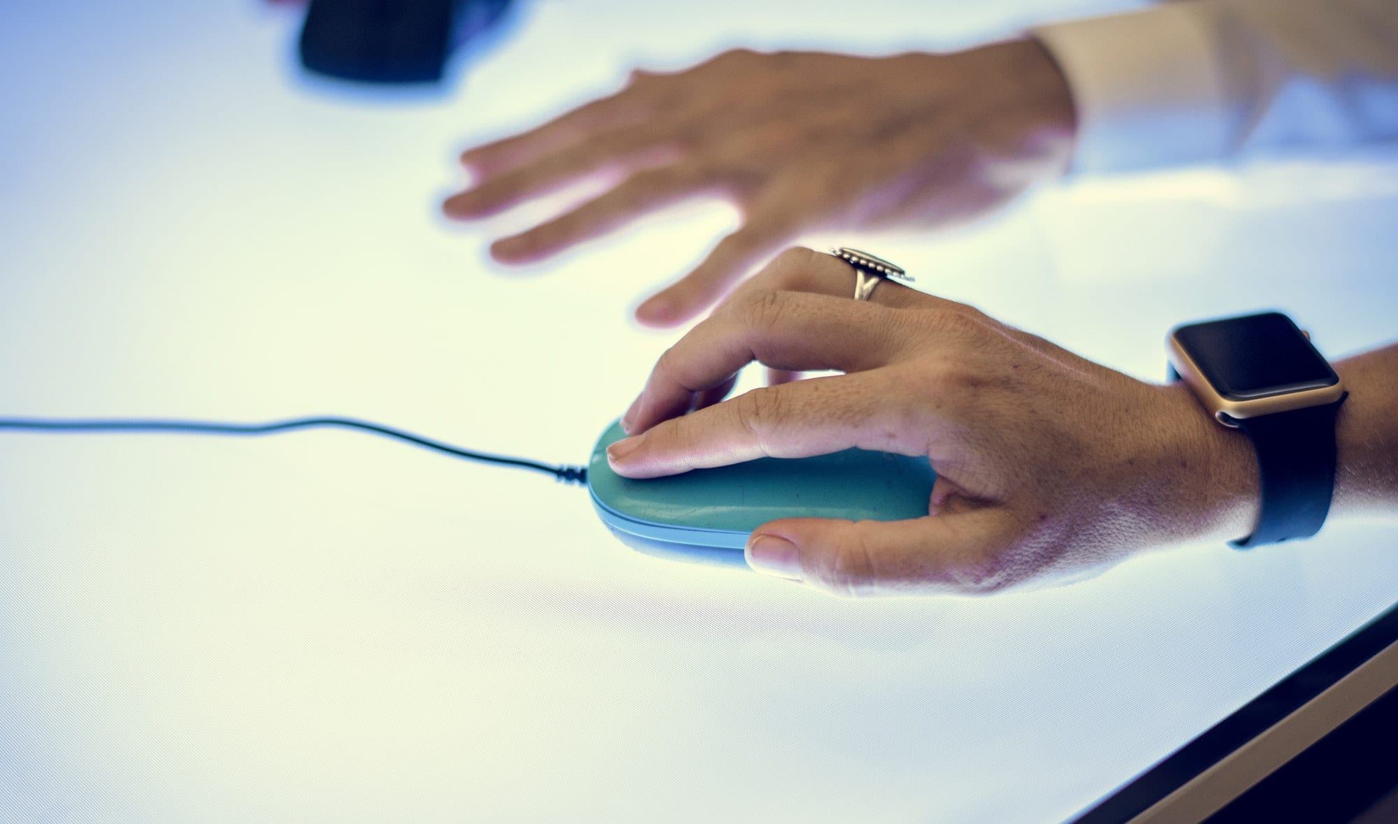
There are 2 main methods to handle navigating from parent to child levels in a navigation: Click, or Hover.
How did that hover business begin?
For several years we’ve seen a lot of sites were preferring the hover method, mostly because of an unofficial web-design rule, known as the “3-click rule“:
The three-click rule or three click rule is an unofficial web design rule concerning the design of website navigation. It suggests that a user of a website should be able to find any information with no more than three mouse clicks. It is based on the belief that users of a site will become frustrated and often leave if they cannot find the information within the three clicks.
Wikipedia
That rule has been proven to be ineffective and detrimental to a user’s experience. Menus hierarchies become chaotic and deep. Users open submenus without wanting to simply because they moved their mouse from the top of the page to the bottom when they switched to the tab.
Hover is not consistent
Not all users use a mouse. Not all users are on a desktop device. There are many ways people interact with technology and many devices they use to browse the web. The “hover” behavior only applies to a desktop/laptop device when using a mouse. That’s a pretty specific scenario.
If a user is on a mobile device then they will interact with websites using a touchscreen – or other methods. Without a mouse, there is no “hover”. You either “click” or you don’t.
A mouse may have been the way most people interacted with a website a decade ago, but that is no longer the case.
Hover is no indication that a user wants to see submenu items.
Unfortunately, we see this all the time. A site has a horizontal menu on the top, and when hovered these top-level items open up a megamenu or their submenus
Tabs on browsers are on the top. So after switching to your new tab, you move the cursor to click on a link in the content, an image, or do something that requires mouse interaction. While moving the mouse, you hover the menu because it’s in your path; right between the place where you were (browser tabs) and where you want to be (content).
As soon as you hover the menu, a huge megamenu appears. You can no longer get to your destination because it is no longer visible. The menu is on top of it, hiding everything else. In some cases these menus are so large that they take over the whole screen, and you have to find those 10 pixels in a corner that are not part of the menu, move your cursor there, then spend the next minute trying to find a path for your cursor that will take you to the content without going over the menu.
Nobody wants to visit a page that stresses them out and challenges them. It’s a UX nightmare. And it’s more common than you may think.
Hover is not accessible
A person with mobility issues or someone with tremors will not be able to efficiently use a hover menu. Hover works for people that have excellent mobility control and can target the area you want them to target with precision and accuracy. Don’t assume that this is a given.
People using a screen-reader and a keyboard will find using a poorly implemented on-hover menu extremely frustrating too.
Using click on the other way is accessible. It works with a mouse or a keyboard, it’s easier to target using various technologies and safer for everyone.
It’s inefficient
Imagine a 3-level deep menu with hover interaction. You hover the top-level menu and the 2nd level appears – usually expanding vertically. You then slide your mouse on the vertical axis, get to the 2nd level that interests you, and a 3rd level appears – usually expanding horizontally. Now you slide your mouse on the horizontal axis and get to the 3rd level, at which point you slide your mouse cursor on the vertical axis to get to the item that interests you.
And now think about this: Each line in your menu is usually no more than 20-30 pixels in height. Sometimes we find some generously-designed menus that have each item 40px or taller, but that’s rare. In August 2019 Amazon’s submenus are 23px tall. Of course, Amazon has other accessibility enhancements implemented, but the design paradigm is evident and widespread. The menu described above would require a user to navigate their cursor with absolute accuracy across a narrow lane of 20px horizontally for a significant width, and repeat that same process again and again and again for each level your menu goes deeper. If at any point they deviate from that narrow 20px “lane”, they are punished because the menu automatically closes (since it’s no longer hovered), or a completely irrelevant submenu opens because they by mistake went on a neighboring item.
Why do we even use hover?
Other than the fact that it’s traditional to see websites use hover for their menus, there is no compelling argument to justify their use. It’s an antiquated bad practice that just continues to live on because of tradition.
Developers know most of the shortcomings of that hover behavior and implement all kinds of workarounds in order to mitigate their negative impact. We add delays in scripts to prevent the accidental opening of a submenu. We write predictive algorithms to better understand the mouse movements and predict where the user wants to go – even if their cursor motion is not smooth. We add fault tolerances in our designs by introducing larger hover areas. As developers, we go to a lot of trouble to make a bad decision work. There’s a better solution to all of the above. Don’t make a bad decision in the first place.
Use click for your submenus
When a submenu expands on click, the behavior is consistent across all devices; from a 4-inch smartphone to a 50-inch smart TV. On a smartphone and
It’s more accessible. No matter the way you interact with technology, there always is a way to “click”. The same can’t be said for “hover”.
It causes less frustration. Especially if you have deep-nested navigations or big megamenus. Click doesn’t get in the way of normal browsing.
Requires fewer workarounds. If any… Since developers don’t need to account for all the bad implications of a hover menu, we end up with an interaction that is a lot lighter, faster and convenient.
The only “bad” thing of the on-click behavior for your menus is that it may take more than 3 clicks for a user to get to where they want to go. But they’ll get there and they won’t close the tab on their browser because the menu is too annoying.
The way we interact with the web has changed. It’s time your navigation changes too.
If you are using WordPress and want an accessible theme with inclusive design principles baked-in, try the Gridd theme. It’s free!