
The most common definition of UX is “the process of enhancing user satisfaction with a product by improving the usability, accessibility, and pleasure provided in the interaction with the product“.
In this article I’ll be focusing on websites, mobile devices and what you can do to improve your visitor’s experience.
Lets start with 2 simple questions:
- How do you use your mobile device when browsing?
- How do you wish you could use your mobile device when browsing?
How do you use your device?
Most people when browsing the internet from a mobile device use 2 hands: 1 hand holds the device and scrolls with the thumb, while the 2nd hand is on standby for those hard-to-reach things. You know… the options button that is located on the top-left or top-right corner and reveals the menu, or the magnifier icon that that lets you access the search-bar.
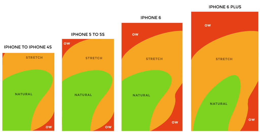
When mobile-device screens were on average 3.5-4 inches a few years ago it made sense ’cause you could still reach those corners with your thumb. It took some stretching, but it was possible. In recent years however with the rise of bigger-screen devices, reaching the top-left or top-right corner of a 6-inch screen while holding the device with that same hand is next to impossible.
Scott Hurff in this excellent article shows how screen size affects navigation with this thumb-zone map:
Is there a better way?
So here’s the real question: Why do most WordPress themes and sites insist on using a mobile navigation on the top left/right corners?
The answer is pretty simple: We’ve gotten used to these navigations. No matter how inconvenient, they are familiar.
What we should be doing however is start creating bottom navigations. When a user visits a website from their mobile device, ideally it should function like a native mobile app. Here’s an interesting article by Nick Babich if you’re interested in learning more about how this can improve your user’s experience and create a more meaningful and less frustrating experience for your visitors. Using a simplified icon-based navigation on the bottom of your page where users can reach and perform the most-used actions is ideal (access their account, cart, your homepage or even search).
Using a bottom navigation for your website will provide a better experience for your users. It is more intuitive and in most cases a lot cleaner too.
If you’re on a mobile device you may have already noticed this site uses such an implementation. If you’re not on a mobile device, try resizing your browser and you’ll notice that as soon as the screen size becomes smaller than a certain threshold the layout changes and the bottom navigation appears. 🙂
If you are using WordPress and want an accessible theme with inclusive design principles baked-in, try the Gridd theme. It’s free!
Photo by Lauren Mancke on Unsplash